 |
TOMO Nara adds plenty of joy to any logo, layout or UI. Geometric shapes and a funny look come together in this font – thus, Nara might be the perfect choice for toys, books, packaging, posters or even webapps! Let’s have some fun!
| |
TOMO Nara adds plenty of joy to any logo, layout or UI. Geometric shapes and a funny look come together in this font – thus, Nara might be the perfect choice for toys, books, packaging, posters or even webapps! Let’s have some fun!


Jessie Neue in a new Serif typeface inspired by popular '70s fonts mixed with grotesque touches.
It has ligatures that make it more elegant and grotesque elements that give it a modern look and make it more versatile. Jessi Neue has a great performance in large body texts and also in high impact headlines. The family has four weights and also a variable version to give more creative freedom.
It has 667 characters that covers the following languages: Basic Latin, Western European, Central European, South Eastern European, Vietnamese, Pinyin and Basic Greek.
The italic version will arrive soon.
 |
Geometric, stylish, and not quite a stencil face: Glance Sans is the urban alter ego of Glance Slab—a strong-willed sans-serif with no frills but a few unique character traits.
Glance Sans follows the design principle of nonjoining parts that made Glance Slab successful. Some strokes may not connect to their stems, creating visible gaps and thus, a dynamic impression of balance and movement. However, Glance Sans has a calmer appearance due to the lack of detached serifs. If Glance Slab’s home territory are large, crowded stadiums and massive sports events, Glance Sans prefers streetball courts, well-used skate parks, and underground clubs. It also adapts to urban work environments from finance to high-tech. Whenever a more toned-down look is called for while retaining the elegance of an athlete, Glance Sans is ready to roll.
In the city environment, versatility is key. That’s why Glance Sans sports 7 weights as well as a complete set of italics. These are not just sloped romans but individually drawn letterforms, subtly referencing classic italic construction for more effective emphasis. Among the 600+ glyphs of Glance Sans, you’ll find goodies such as six sets of figures, circled numbers, circled arrows, and all kinds of currency symbols in two stylistic versions. Glance Sans is a great tool for industrial and high-tech branding, for wayfinding systems in contemporary or modernist architecture, for corporate identities in arts, crafts, medicine, culture, and education, and for all kinds of sports-themed design.
Both members of the Glance superfamily are easily and effectively combinable; both are able to stand on their own feet. With its powerful italics, you might opt for Glance Sans as your text typeface and use Glance Slab for headlines. Or you set large, clean, display-sized lines in Glance Sans and spice them up with a bit of sportive Glance Slab. It’s up to you to decide how to bring out the best in both of them.
 |
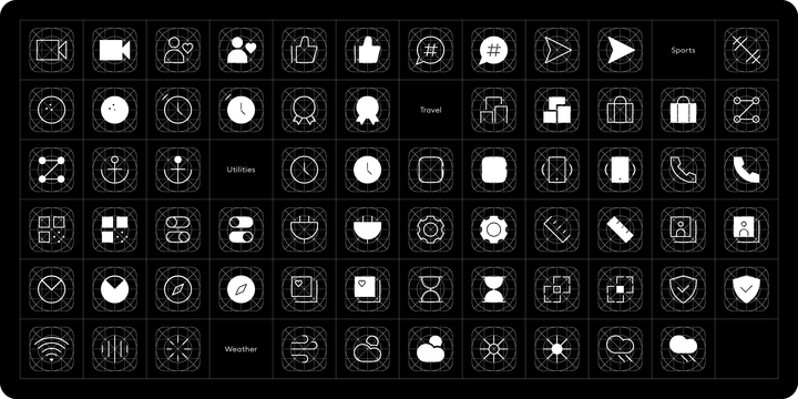
neue OS Icons is a font to personalise app icons on your iPhone. The family of six weights enables you to style your iPhone screen in multiple ways: as a collection of stylised icons in outlined and filled variants or as a purely typographic setting with one or two letter icons. And if you want to crank up to eleven superimpose a grid onto each icon. Caution though: Nerd alert!
The neue OS Icons was designed in a similar fashion as neue UXUI Icons. Unobtrusive and elegant in appearance with legibility and distinctiveness in mind. neue OS Icons covers all 26 Apple categories from entertainment, social networking to navigation and many more. You have the choice between two and ten different icons for each category in order to make your phone truly unique and personal.
To do so just download our Adobe Illustrator template which features all 260 stylised icons, 144 one letter icons and 100 two letter icons. Export as PNG and start personalising your iPhone. Not sure how? Watch our short video that walks you through all steps.
A picture is worth a thousand words. To spare you the thousand words we’ve created a PDF that showcases all available neue OS Icons with their names and categories. This is especially handy if you want to use typographic symbols. Want to test neue OS Icons before you buy? Request fully functioning trial fonts here: hi@neuefoundry.com
 |
| Download Neue OS Icons Fonts Family From Neue |
 |
Legible, technical, clear—with a hint of retro: Compiler is a no-frills font family straight from the heart of a microprocessor.
Inspired by console typefaces, the humanist sans serif typeface combines a large x-height with striking serifs on certain letters such as i and l. Those serifs evoke the aesthetics of monospace typefaces for programming. Even though Compiler is a proportional typeface, this detail improves glyph recognition and helps differentiate between individual letters. Combined with vertical stroke ends, which allow for particularly even spacing, the serifs make for an extremely legible typeface. (Even in small sizes.)
Brand recognition guaranteed: Compiler is ideal for applications that require a mechanical flavor without appearing offish. You can use it for websites, apps, branding, corporate design, annual reports, signage, and many other areas with perfect results.
Compiler consists of two font families; the second one is Compiler Plain. In Compiler Plain, the signature letters lose their serifs and the forms of "a" and "g" are simplified. This way, the shapes are neutralized. The technical impression recedes into the background. Both families can be combined smoothly: you might use the standard Compiler fonts for display sizes and Compiler Plain styles for body copy. For total design control, you can toggle each of the defining design elements individually from Compiler to Compiler Plain and vice versa. Just use Stylistic Sets to fine-tune your Compiler fonts.
Compiler provides you with 8 weights in 4 variations: Upright, Italics, Plain Upright and Plain Italics. That's a total of 32 fonts. Each style contains more than 860 glyphs, including advanced typographic tools such as proportional and tabular figures (both lining and old-style) or small caps—something you'll rarely find in this genre. Other glyphs are optimized for display sizes, such as circled figures and various arrows. There's also a set of glyphs designed for web use: with symbols for shopping carts, hamburger menus or checkboxes, you can implement your web projects elegantly and consistently without relying on third-party tools (like an external icon font).
Powered by highly productive OpenType functions, Compiler is an intermedia workhorse straight from cyberspace.
 |
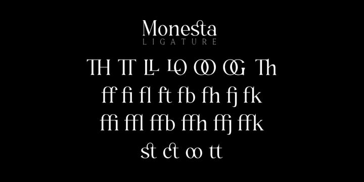
Mirtha Display is a clean and elegant decorative font with 40+ ligatures and the ability to create chains (make a shape in Illustrator, type @@ to form a link on it and there it is, an editable chain).
Inspired in art deco but with a modern touch it works perfectly in short headlines. It comes in two weights with italics and it has flexibility to perform well within retro or modern designs and can serve in a wide range of projects from posters to branding, logos, packaging, magazines and more.
Mirtha Display extends multilingual support to Basic Latin, Western European, Euro, Catalan, Baltic, Turkish, Central European, Basic Greek and more.
 |
| Download Mirtha Display Fonts Family From Nois |
 |
Monesta® is a confident smooth serif font family. Designed by Aulia Rahman, Monesta® it creates a sense of softness and expressiveness. the concept into usability focused direction, to work as a bold tool and beautiful communicator.
Monesta variable allows design across 9 weights, major Latin based languages, and Cyrillic. Monesta® bringing energy and making it suitable for modern design.
 |
| Download Monesta Fonts Family From Showup! Typefoundry |
 |
Along Slab WORK is a elegant Slab Serif font family, which designed by Ryuld Davidson of the Brenners Template.
It retains the skeleton of the Along Sans S2(https://www.myfonts.com/fonts/brenners-template/along-sans)
Especially, all italic styles were rhythmically redesigned for inspiration of glyphs.
This font family has a unique personality for each style and will help a designer's choice.


Katerina P Rounded was designed by Nikolay Savchuk. Katerina P Rounded is a modern versatile sans-serif typeface. What differentiates Katerina P Rounded from the other fonts is an exceptionally distinctive design. It is brilliantly suited for graphic design and display use and perfect for logotypes, t-shirts, packaging, brand identity, books, magazines, newspapers, posters, billboards, and advertising.
 |
Tabularasa is a modern grotesque typeface with an organic aesthetic. It is very legible in small sizes and full of refined details in display sizes.
Furthermore, it features a whole set of stylistic alternates that offer additional approaches for its usage.


Say Hello to Nostalgia! A Modern Font with a retro feeling 3 Fonts Regular, Effect and Flowers
You can Access your OpenType features and discover a large choice of alternate glyphs for caps, ligatures swashes and more. This font is very versatile, covering a wide range request, from logos, headlines, branding, magazine design , to wedding cards, poster and so much more.
 |
TT Octosquares is a fresh, revised, expanded, and significantly improved version of our first commercial typeface TT Squares and its narrow version TT Squares Condensed. With all our love for the original font family, it felt there was a lack of functionality, character composition, features, and design freshness, which prompted us to the idea of a complete restart. Now TT Octosquares can be safely called a superfamily consisting of 4 widths (Compressed, Condensed, Standard, Expanded), 72 faces (18 in each width), and 1 incredible variable font in which variability works jointly on three axes.
In addition to working on the contours themselves and their design, we completely revised the composition of the typeface. First, we added two completely new widths: Compressed and Expanded. Secondly, we increased the number of weights in each of the subfamilies—while in the old versions there were 5 weights, now in each of the subfamilies there are 9 weights. At the stage of working with the contours of characters, we revised the roundings, changed the forms of shoulder and stem crossings, added noticeable shelves at the letters, removed the sharpness from the triangular characters and cut off all sharp endings.
From the very beginning of work on TT Octosquares, we planned to make a variable 3-axis version of it sewn into 1 font file. This means that by installing just one variable font file, you get access to three axial adjustment of the font: by thickness, width and inclination. Thanks to this flexibility in settings, you can always choose a custom combination of thickness, width or inclination that best suits your tasks.
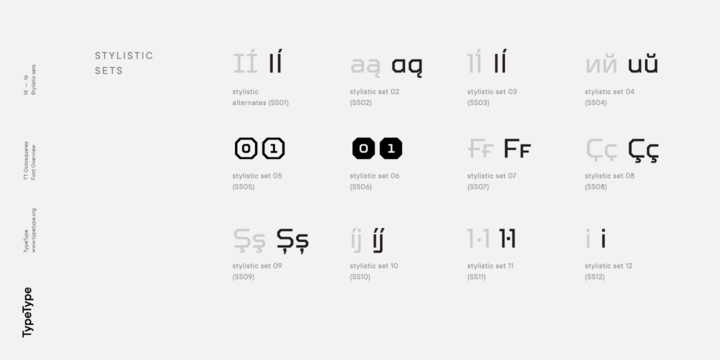
Due to the increased language support and the appearance of a bunch of useful OpenType features, the number of glyphs in the typeface has increased from 480 to 825 in each style. Now you can use stylistic alternates, standard and discretionary ligatures, or use old-style figures, numbers in circles and even slashed zeros in your design. Full list of features: aalt, mark, mkmk, ccmp, subs, sinf, sups, numr, dnom, frac, ordn, lnum, pnum, tnum, onum, case, zero, dlig, liga, salt, ss01, ss02, ss03, ss04, ss05, ss06, ss07, ss08, ss09, ss10, ss11, ss12, calt, locl.
To use the variable font with three variable axes on Mac you will need MacOS 10.14 or higher. For other software and browsers, you can check the support status here: v-fonts.com/support/.
 |
| Download TT Octosquares Fonts Family From TypeType |
 |
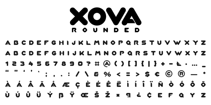
Xova Rounded is a geometric rounded typeface. The use of perfect round shapes and quite a low ascender height makes it a very stable, yet playful looking typeface.
 |
| Download Xova Rounded Fonts Family From Cerri Antonio |
 |
 |
 |
 |
 |
 |
 Fonts Family From Bold Studio") |


